IMDb’s Highest Rated TV Series
Note: this graph works best if you load it in its own tab, zoom in and scroll around. Have fun!
What?
Sometimes I like to look through posts on r/dataisbeautiful for graph inspiration. There can definitely be a lot of noise, but it also has a lot good ideas for data sources and visualisations. I’m pretty sure it was on there that I first saw graphs showing IMDb ratings for different films and TV series, which in turn lead me (inevitably) to IMDbPY. Whenever I’m thinking of checking out a different API, there’s probably already a Python module for that.
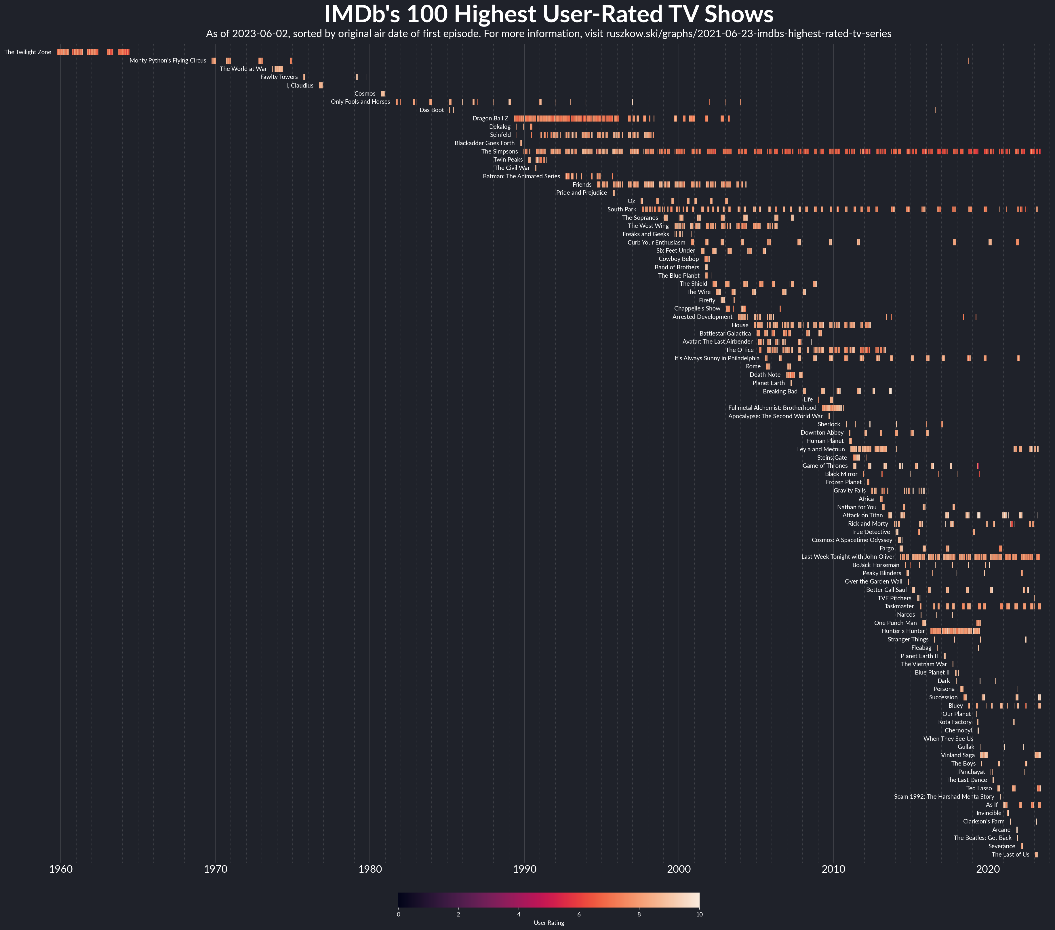
While tinkering around with some ideas about visualising individual TV series (more on that soon), I noticed that the main entry point for the module has a get_top250_tv method for finding the 250 highest-rated TV shows. I started playing around with that a bit, and this is wshere we ended up (albeit with only the top 100 shows in the chart).
How?
At first, I thought about trying to use a swarmplot from seaborn to visualise the different user ratings of different series, but it (and the similar stripplot) can get congested quite fast when displaying a large number of categories. Instead I took a step back to something a bit more basic, but that I’d never really used before. Most of my scatter plots in matplotlib tend to use either the . or o markers (or maybe an x if I’m feeling exotic) - these are the kinds of markers we expect from a traditional scatter plot. Another of the built-in marker styles though is simply a vertical line - noted with a |. By using this marker frequently with the same y-value and varying colours, we end up with these lovely “carpets” of data.
Having the data sorted from highest to lowest rated was interesting, but made it a little confusing to read, as your eyes would need to jump from left to right between older and newer shows. By sorting according to the show’s first episode date instead, we get a lovely curve that the eye can follow more smoothly. I also moved the labels from their traditional position on the y-axis to instead be slightly offset from the first episode - with the regular placement, it got quite difficult to be sure which series you were looking at when it came to the more modern shows. One slightly unexpected aspect of this - I had to force the graph to draw, with fig.canvas.draw(), in order to actually get the correct text from the y-axis labels to then annotate them back onto the chart.
One last thing here - as the top rated shows on IMDb will probably change over time, I tweaked the GitHub Action I’d set up for the Covid vaccine graphs so this graph will update at midnight on the first of each month or whenever I change the Python script. GitHub Actions truly are magic.
Libraries / Resources
IMDbPYfor getting the data andpandasfor working with it nicelymatplotlibandseabornfor plotting- My own
plot_stylesmodule for getting some of the basics of the plot looking nice quickly - As with the Covid vaccine graphs, I used Lato for the font as it comes bundled in GitHub’s Ubuntu environments
Data Sources
- Unsurprisingly, the data is all from IMDb
Code
Find it on Github