Covid-19 Vaccinations
What?
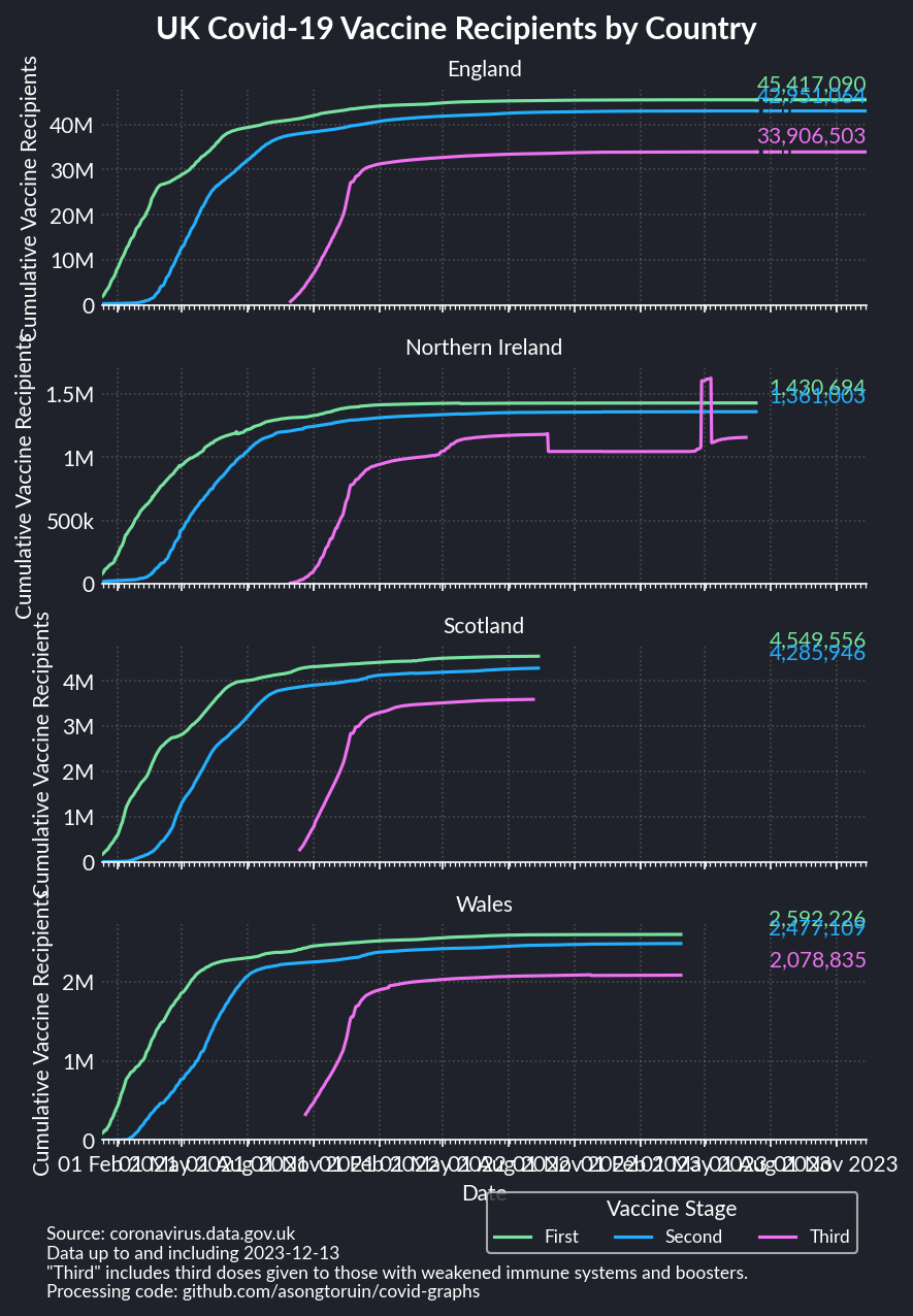
The UK government has been offering up a lot of open data through its Coronavirus data portal, but much of it is intense and slightly stressful. One perhaps more positive piece of information it offers is the number of vaccinations that have been provided, for both the first and second stage. I decided that might be something a bit nicer to plot.
How?
So not only is the government offering up a lot of open data, they’ve also
provided a
Python module
for easy access to the data, including directly to pandas dataframes. From
there it was extremely easy to pull together the data, and there’s nothing
particularly fancy about the graph itself.
What is fancy about this however is that the graph should automatically be updated every day through Github Actions. I’ve gone into detail about this in its own post.
Libraries / Resources
- The usual
pandas/matplotlib/seaborntriplet - My own
plot_stylesrepo for gettingmatplotlib’s colours to match up with this blog uk_covid19to get the data- The font used is Lato, as this is one of the default fonts in GitHub’s Ubuntu environments
Data Sources
- The Coronavirus data portal via its Python module
Code
Find it on Github