IMDb Series Rating Summaries
What?
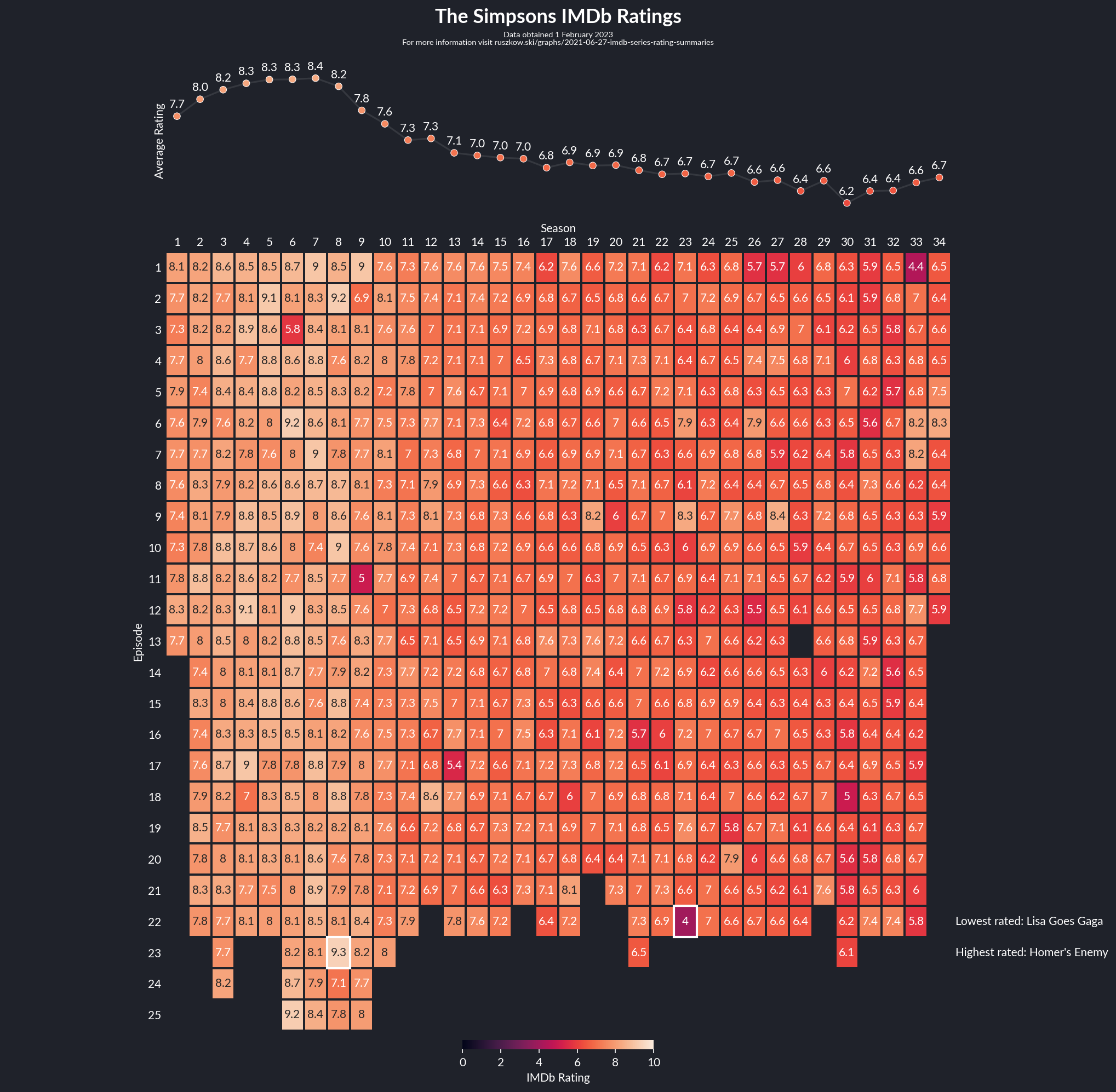
As I mentioned in the summary of my highest rated TV shows on IMDb graph, I originally started trying to summarise user ratings for every episode of an individual series. It took a bit more work, but I think I’ve got something reasonable now. The layout I decided on ultimately was a scatter plot showing the season averages above a heatmap showing the rating for every episode, highlighting the overall highest and lowest rated episodes too.
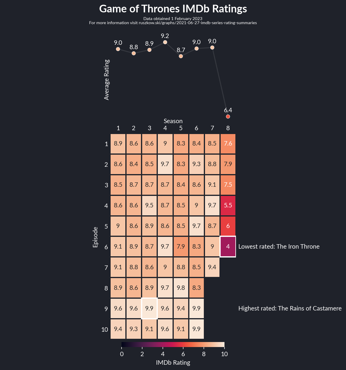
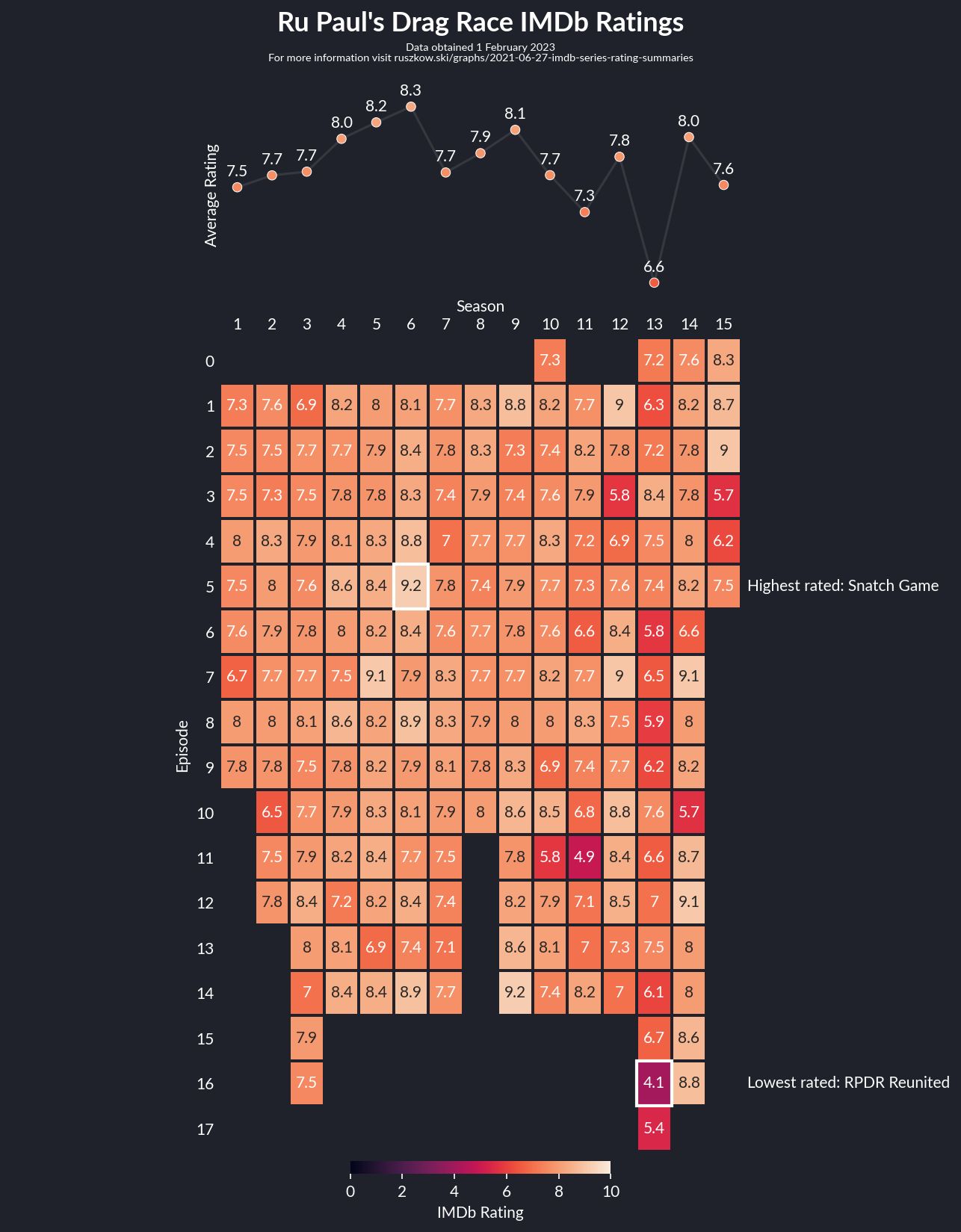
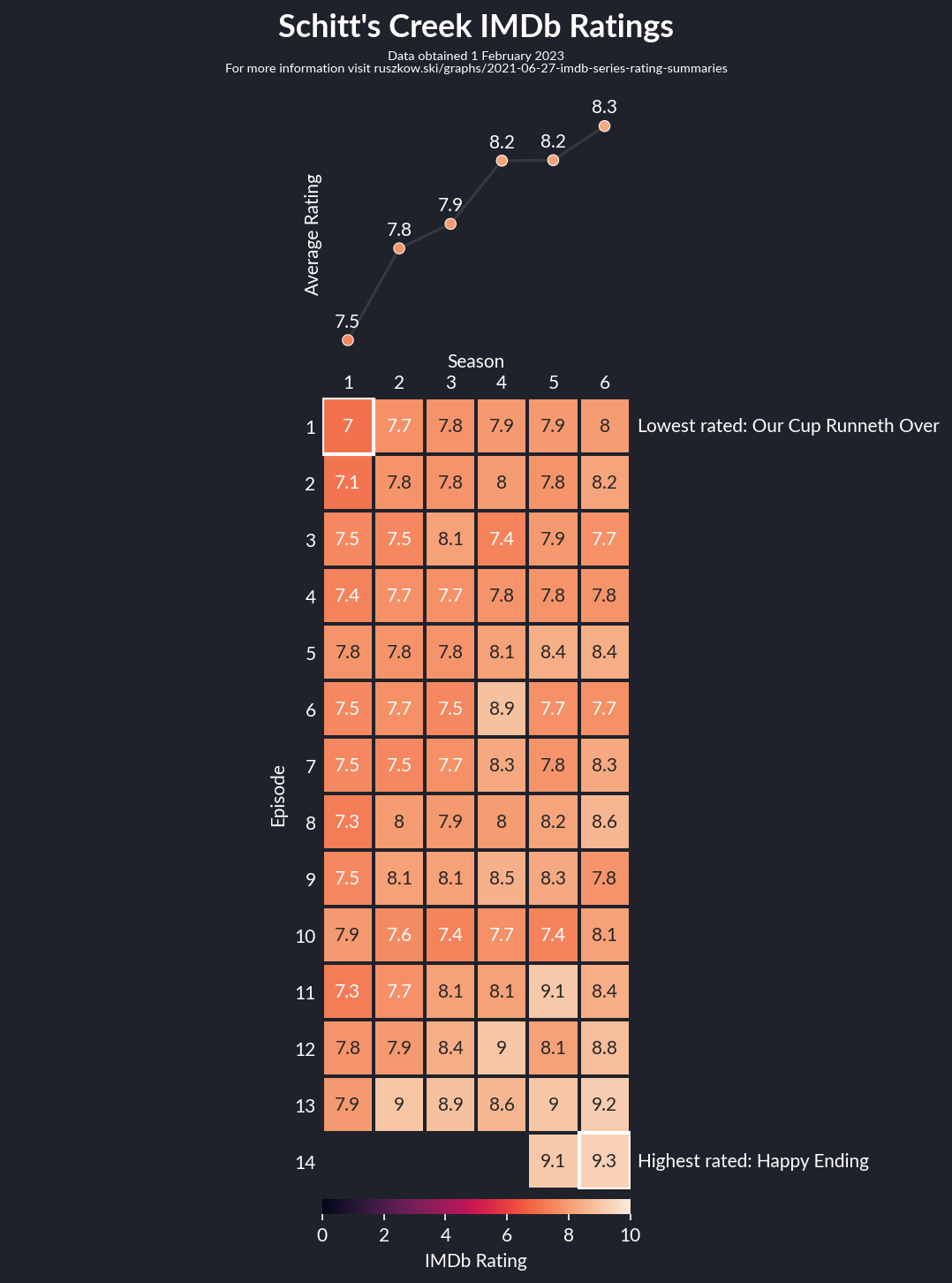
The above chart shows The Simpsons, as it demonstrates a rather impressive decline over time, but the process is generic, so I’ve created charts for various series. All of them can be found here, and below are a few interesting ones.
How?
At its core this is quite simple - a heatmap and a scatter plot can each be done fairly simply with seaborn. The hard part here was all the extra bits. A few things in particular stand out:
-
Getting a generic layout working when there can be large variation in the number of episodes and the number of seasons of a show was a bit fiddly. I ended up scaling according to both, but this is probably something that could be refined.
-
The scatter plot needed offsetting to ensure the series averages align properly with the heatmap.
-
I had various different ideas for how to highlight the highest and lowest episode, ultimately settling on using a white square to highlight them and a text annotation to give the episode name (as it makes them way easier to remember). This in turn caused its own issue, as the text on the right made the overall chart lopsided. My slightly dubious workaround here was to basically draw the same text again on the right hand side but make it completely transparent -
matplotlib’stight_layoutwill take this text into account without it affecting the actual visual. It works!
As with the top shows chart, I’ve again set GitHub Actions to update all of the charts on a monthly basis so these should update with any change in ratings or new episodes aired.
Libraries / Resources
Almost identical to the top shows chart:
IMDbPYandpandasfor the datamatplotlibandseabornfor plottingplot_stylesfor basic plot styling- Lato for the font
- The only addition here is
PyYAML, which I use to read in the list of series to plot
Data Sources
- Again the data is all from IMDb
Code
Find it on Github