Biffy Clyro Chart Positions
What?
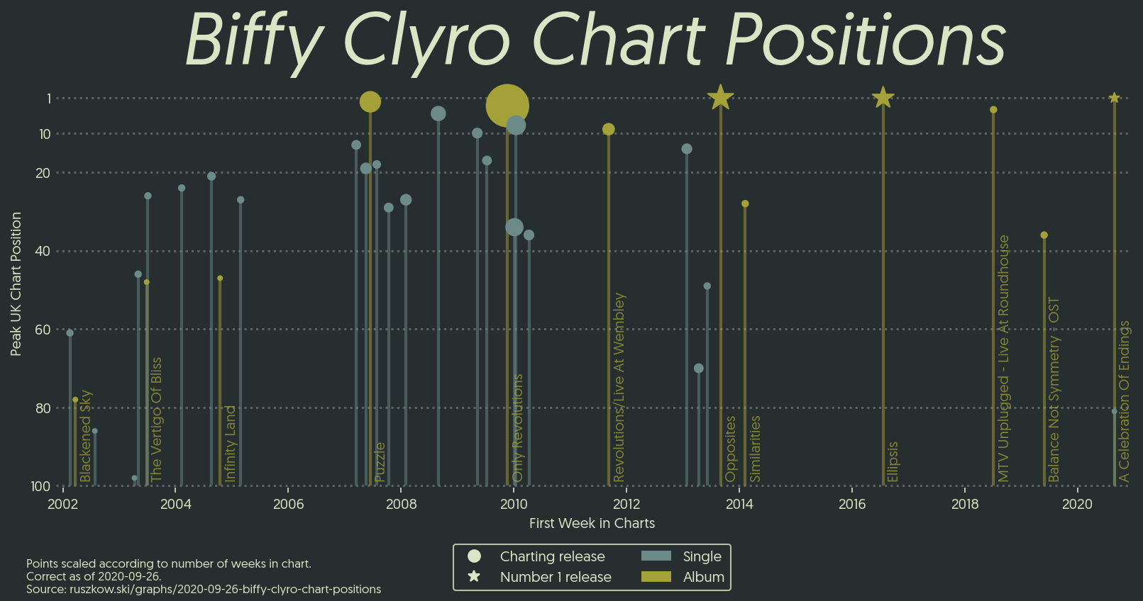
This graph shows the peak UK chart position reached by each release from Scotland’s greatest band, Biffy Clyro, to have cracked the top 100. Each point is scaled in line with the number of weeks the release has spent in the top 100.
I first came across the idea of a “lollipop” charts through Spotify’s
chartify library a while ago, and
have been trying to think of something that would look good as one. Biffy’s
latest album, A Celebration of Endings, managed to reach number one in the
album charts, and that got me thinking about how their previous releases had
performed in the charts.
How?
Using axvlines and scatter in matplotlib makes drawing the lollipops easy,
and obtaining the data was incredibly simple with pandas.read_html.
Libraries / Resources
matplotlibpandas, with the additional dependency oflxmlin order to useread_html- Geomanist for the font again
- The colour palette I’ve used here is actually one extracted by my album art bot from their best album, Infinity Land
Data Sources
- Chart stats were sourced from the Official Charts site’s Biffy Clyro page
Code
Find it on Github