Big Five Champions
Update 2021-06-01: updated to include 2020-2021 season, and some visual tweaks
What?
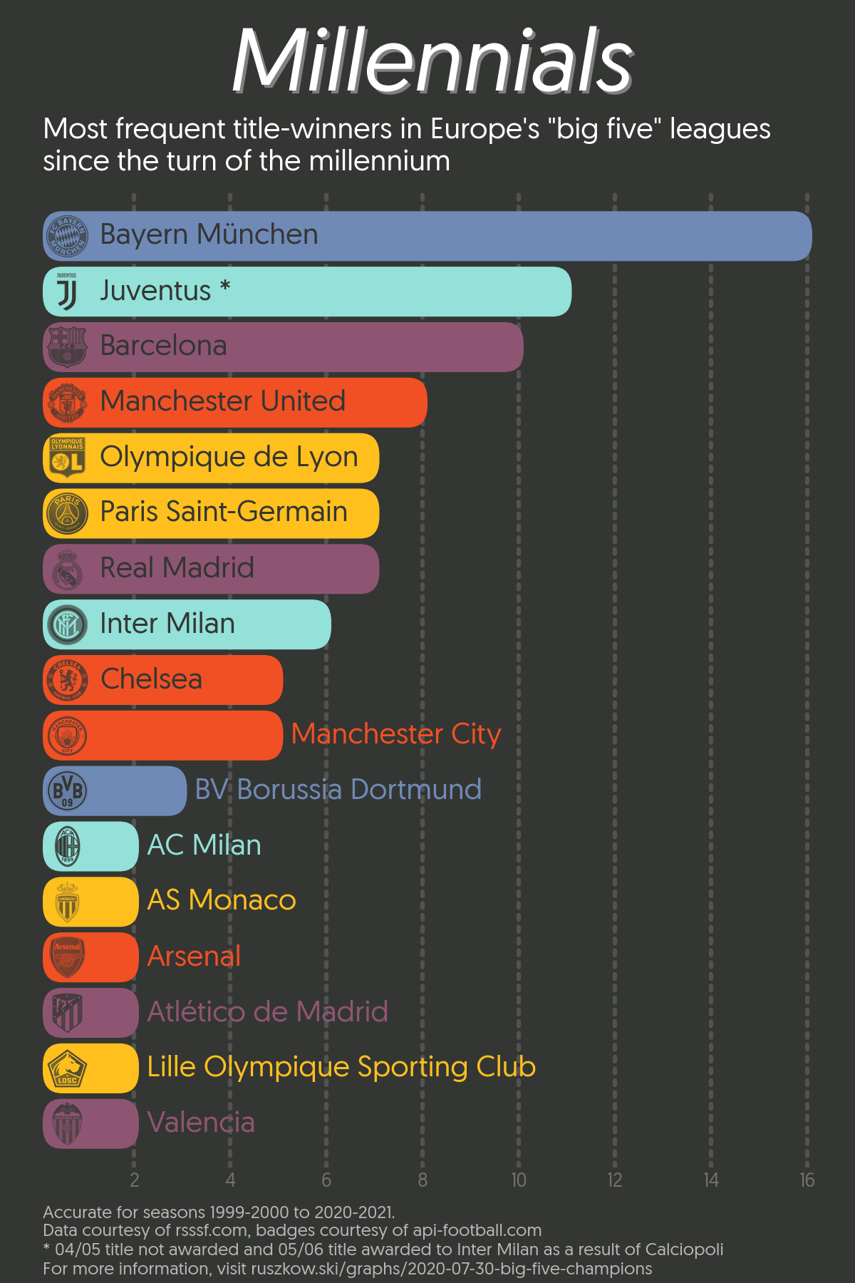
Yet another football graph, and yet another bar chart. This one needs to be viewed in full-screen to get the full effect!
As the (Coronavirus-prolonged) 2019-2020 football season finally draws to a close across Europe the traditional “big five” leagues (England, France, Germany, Italy and Spain) seemed to be won by the expected teams, with Liverpool’s first English title for 30 years proving somewhat of an outlier.
With that in mind, I decided to look at how frequently teams had won those leagues in recent years, with the 1999-2000 season seeming like a convenient starting point.
It didn’t come as much of a surprise to me that Bayern Münich and Juventus came out on top, though I was surprised by how relatively recent PSG’s dominance of the French league has been.
As with my last graph, here’s a development gif!
How?
Really fiddly matplotlib code! What a surprise.
Rounded bars aren’t available directly in matplotlib, so it took a bit of
faff to get them to look good. In short, you have to loop through each bar,
use its coordinates to draw a new patch that has rounded corners, and then
delete the old bar.
Getting the badges and text onto the bars without awkward overlaps was similarly tricky. The canvas has to be redrawn to ensure the items are actually appearing in the correct place.
Libraries / Resources
matplotlib, my one true lovepillowfor recolouring and resizing the badges- Another lovely Atipo font - Geomanist
Data Sources
- RSSSF provided all of the data through its “List of Champions” page for each league. The England page, for example, is found here
- api-football was used to get the badges, as they provide nice PNGs of each team’s logo with transparent backgrounds.
Code
Find the main processing code on Github
The gif generation code was identical to in the UK Bisexual population post