2019 Gigs
What?
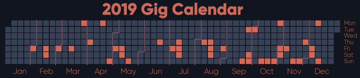
A calendar plot showing every gig I went to last year, including festivals. Every orange square represents a day where I saw live music, in effect. Mid-September to mid-December was a bit of a wild time.
How?
The two steps needed to produce this are almost entirely separate:
- Getting and processing the data
- Producing the graph
Getting the data
Google allows you to download an ICS file of all of your calendar events via its export functionality. This, however, contains all events from your calendar, so it needs a bit of work. I wrote a short script to extract all of the 2019 events, and then manually deleted rows that didn’t relate to gigs. Is it elegant? No, but the majority of events in my calendar are indeed gigs, so it wasn’t too much effort.
Producing the graph
calmap is one of my favourite libraries, but I rarely get to use it outside
work so this was more or less an excuse for me to play with it a bit and make
something that looks nice. A little rejigging was required to make sure that
multi-day events (basically just the two festivals I attend every year)
were properly represented, but otherwise this part was fairly straightforward.
Libraries / Resources
icscalmap, specifically a fork I generated at work, with nice dividers between the months- Gilroy, a font available for free
Data Sources
As previously mentioned, this relied on my Google calendar for the dates of individual gigs, though obviously I don’t want to share that here. Instead, here’s a playlist featuring one song that was played at each event, in order of attendance.
Code
Find it on GitHub