Edinburgh 2017 Temperatures
What?
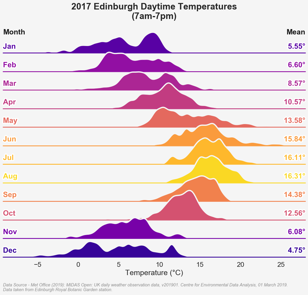
A ridge plot (i.e. overlapping distributions) showing the average hourly temperatures at a particular location in Edinburgh in 2017, for the roughly daytime hours of 7am-7pm.
How?
This is based quite heavily on
an example
given as part of the seaborn documentation. The only real tweaks made to This
are to use the average temperature to determine the hue rather than just the row
and some neat labelling.
This site has long-term data available so ideally I’d like to create an animation showing the changes in temperature over time, though that seems like an optimistic goal at the moment!
Libraries / Resources
pandasmatplotlibseaborn
Data Sources
- MIDAS Open: UK daily weather observation data (registration is required to access the data, but it’s very straightforward)
Code
Find it on Github