2022 Running Totals
What?
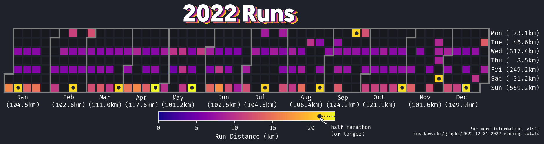
This year, as in the previous two, I’ve been running fairly regularly. I thought it might be interesting to plot my runs across the year. In particular, I had two targets that I’d set out at the start of the year:
- To run over 100km every month
- To run a half-marathon every month
I managed to hit the first (despite two bouts of COVID!) but unfortunately missed the second by a single month - I’d left my half for June until the last weekend in the month and woke up on the Sunday morning feeling rotten, so only managed a shorter run. 11/12 isn’t too bad though!
How?
calplot really does a lot of the heavy lifting here, especially when coupled with Strava’s APIs allowing for pretty straightforward data access.
The one additional thing I tried to do was highlight the half marathon runs - this needed some slightly fiddly work, adding a scatter plot on top of the calendar. Once I understood that it just uses week numbers as the x-coordinate and day numbers as the y-coordinate (with a little shifting), it was fairly simple.
Libraries / Resources
pandaswithrequestsfor getting and processing the datacalplot/matplotlib/seabornfor plotting- My usual
plot_stylesfor the basic plot styling - Geomanist for the title font
Data Sources
All the data is taken directly from the Strava APIs!
Code
Find it on Github