Basic matplotlib Bar Plot Styling
What?
Last week, my friend’s partner was telling me he was starting to look at plotting in Python. Between this and various people at work getting started with matplotlib, I thought it might be helpful to do some step-by-step cheatsheets to show how to interact with different chart elements in matplotlib. Bar plots are one of the most basic (and useful!) plots, so I thought I’d start there.
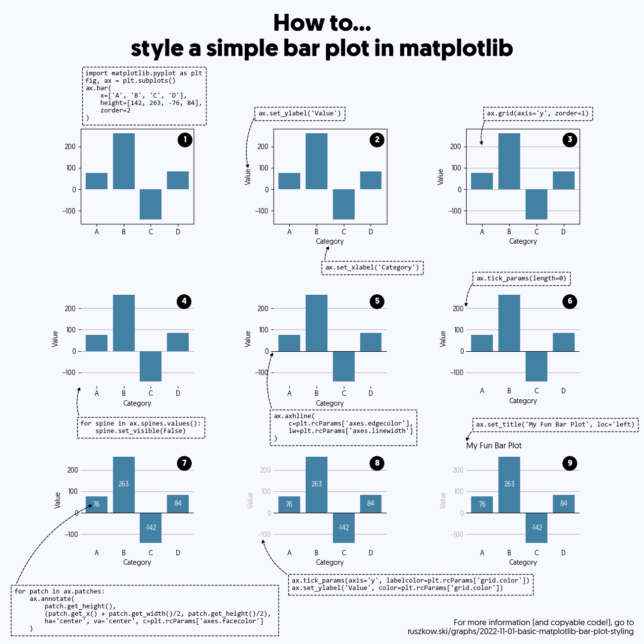
In total there are nine different elements covered here, from top-left to bottom right:
- Drawing the basic bar chart
- Adding x- and y-axis labels
- Adding gridlines
- Removing the spines
- Adding a
y=0line (to emphasise negative bars) - Removing the tick marks
- Adding labels to the bars
- Recolouring the y-axis tick labels and axis label to make them stand out less
- Adding a title
This takes a bar plot from a fairly simple chart, with some very simple code:
To something that might be ready for display, albeit with quite a bit more code!

How?
I decided that making the changes step-by-step on a single “page” would let people easily identify exactly what was changed in the graph at each stage, and how the code had influenced that. The easiest way to do this was to just set up a lot of subplots, and then apply each change from the current chart onwards. Describing those changes ended up requiring some quite extensive (and fiddly!) annotations, but standardising a few of the elements did make it a little easier.
I did also cheat slightly by using a stylesheet to improve the basic styling of the chart. Several of the steps here could be skipped by using a well-defined stylesheet (3, 4, 6 and 8 I think) but I think it’s good to know how all of the elements work. Maybe I’ll have to do something else on stylesheets…
Libraries / Resources
matplotlibdoes pretty much everything here- …but of course, I had to use Geomanist for a nicer font
Data Sources
None!
Code
Find it on Github