Mapping England’s Most Common Pub Names
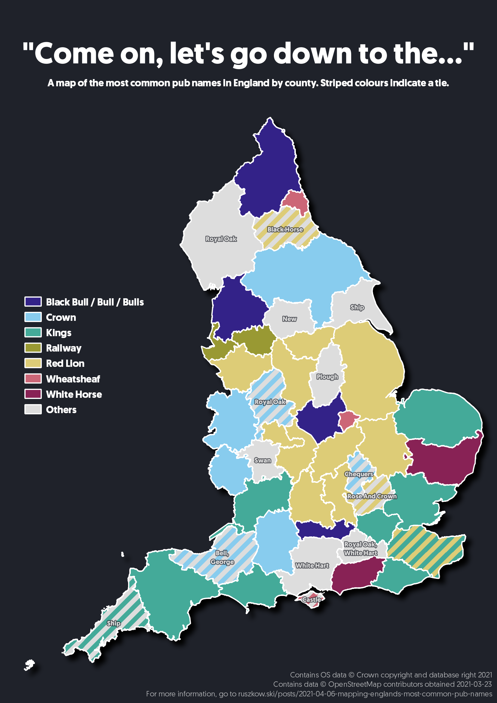
After making my graphs about the most common pub names in each country in Great Britain, one thing that really stood out was just how many pubs in England are called Red Lion. Being from the Midlands that made a lot of sense to me, but a few people who I showed it to seemed quite surprised. That got me thinking about what kind of regional variation there is in pub names. So, why not look at the most popular pub names by county? This gives us a chance to dig into QGIS a bit, which I tend to use a lot at work for producing maps but haven’t talked about on here yet. Let’s dive in.
Data Sources
I started with the same OpenStreetMap data that I used in the graphs with the same cleaning applied for the names as it was all already geolocated, giving us a set of points representing each pub.
Next up - getting the county boundaries. Generally, the best UK source for standard boundaries is Ordnance Survey. Its Boundary Line product includes the county boundaries alongside multiple other regional definitions. One slight oddity in the county boundaries provided is that the City of London is provided separately to Greater London. For my purposes that’s a bit too refined, so I merged the two into one region and extracted only the England counties.
Merging The Shapefiles
Combining spatial data involves doing a spatial join - joining the layers of data together according to their location in space. As we have a point layer for our pubs and polygons for our counties, it’s a fairly straightforward join to apply.
There are a few different ways you could go about this - QGIS itself can handle spatial joins, but as we want to get the most popular name within each county keeping it all in Python means geopandas can handle this at the same time. You can find the code here.
Displaying The Results
Once we have the output from the above script, that can be dropped straight into QGIS.
I was torn over how to display the summaries - at first I tried outlining each county and adding a label, but that resulted in an extremely messy map that was a bit overwhelming to read. Applying randomised colours to that made it a little easier to associate each label with its corresponding region, but then it became confusing that the colours didn’t actually mean anything.
Instead, I noticed that a few names were appearing a lot of times and some others only once. Instead, I used QGIS’ Categorised Symbology settings to assign a colour for every unique label, and started deleting the less-commonly occurring names so those regions would instead show up in the “All others” category. At this point I chose to merge together “Bull”, “Bulls” and “Black Bull” as they’re all pretty similar names.
A few regions had a tie for the most common name. Fortuitously for me, we didn’t get any regions where we’d need to use more than two colours, so I decided stripes would be an easy way to represent a tie. I had to manually go through and set up the styling for each of these ties within the category settings, which was a bit of a faff but thankfully didn’t take too long.
Making The Colours Accessible
With my first attempt at this, the colours QGIS applied by default were pretty garish and wouldn’t have been very useful to any colourblind observers. In searching for a colourblind-friendly palette, I found this excellent write-up from David Nichols which in turn directed me to Paul Tol’s beautiful colourblind-friendly palette. Once again, I got pretty lucky in that my map didn’t need more colours than the palette provides.
Fine-Tuning
At this point the map was pretty much done, but there were a few final tweaks to do. Adding a drop-shadow to the whole layer to gives the map a bit more of a presence on the page, and makes it look a bit neater. QGIS also has a lovely “Print Layout” feature which lets you combine a map with various other decorations like legends and labels to create something ready for print, which let me add in the extra features you see.
The other big change I chose to make was to add labels for any use of the “All others” colouration. Ths ensures that as much data was available to the viewer as possible while not being too overwhelming. It was, however, probably the most fiddly part of the whole setup as labelling the striped sections required a very specific labelling rule:
CASE
WHEN strpos("name_short", 'Red Lion') > 0 THEN
	if(
	  "name_short" != 'Red Lion',
	  replace(replace("name_short", 'Red Lion, or ', ''), ', or Red Lion', ''),
	  ''
	)
WHEN strpos("name_short", 'Kings') > 0 THEN
	if(
	  "name_short" != 'Kings',
	  replace(replace("name_short", 'Kings, or ', ''), ', or Kings', ''),
	  ''
	)
WHEN strpos("name_short", 'Crown') > 0 THEN
	if(
	  "name_short" != 'Crown',
	  replace(replace("name_short", 'Crown, or ', ''), ', or Crown', ''),
	  ''
	)
WHEN strpos("name_short", 'Wheatsheaf') > 0 THEN
	if(
	  "name_short" != 'Wheatsheaf',
	  replace(replace("name_short", 'Wheatsheaf, or ', ''), ', or Wheatsheaf', ''),
	  ''
	)
WHEN "name_short" in ('Black Bull', 'Bull', 'Bulls', 'Railway', 'White Horse') THEN
    ''
ELSE
    "name_short"
END
This… works, but is rather inelegant and extremely fragile. As this is a one-off map, I’m not too worried about this, but for any kind of ongoing analysis, I wouldn’t recommend using something quite so hard-coded.